
Talk Like TED
There's little more inspiring than a bold concept delivered by a great speaker. But what's the secret to wowing an audience?


They say that talk is cheap. It isn’t. Anyone who has sat through a verbose, over-charted presentation and calculated the cost of all the people watching online or – remember this? – sitting in the room, will know this truth. Poor presentations are very expensive. Here’s how expensive:
Microsoft calculate that there are over thirty million business presentations given around the world on any given day in meetings.
15% of an organisation’s time is spent in meetings.
Ineffective meetings make professionals lose 31 hours every month, which adds up to 4 working days.
If a company has 100 employees earning, on average, £50,000 a year, that’s £1 million in wasted value sitting in ineffectual meetings (just their salaries, let alone all the other employment costs).*
What are the biggest reasons for ineffectual meetings? They’re too long, they’re unstructured and nothing comes of them. And what exemplifies this? Very poor presentations – too long, unstructured and nothing comes from them. Poor presentations waste eons of people’s precious time.
And that’s not counting the result of the presentation. If it’s a presentation to win a new client and it’s a disaster, that could be even more millions up the Swanee. Not just in lost potential revenue but also in the costs of all the work preparing the presentation before the meeting.
Poor presentations can be ruinously expensive. Getting the words (and pictures and graphs and numbers) wrong costs companies around the world millions of $, £, Yen, Euros, Renminbi every day - in lost sales, in wasted effort, in miscommunication and in wasted time.
What to do?
Don’t be part of the 'We’ve done all this work and you’re damn well going to see it’ school of presentation
Let’s face it, when we’re asked to make a presentation, most of us stampede for the PowerPoint (or Google Slides or Prezi – we’re not being biased here). We rush to open a fresh slide. We cut and paste from previous presentations. We put everything in it to ensure we leave nothing out. It’s so satisfying producing a deck in just fifteen minutes. We’ll edit it later, we say to ourselves. (We don’t.) We kid ourselves we don’t need to rehearse it because, well, we’ve presented all this stuff before, so we know it well enough. (If you catch yourself thinking this, just ask yourself what the result was last time you made this presentation. If it was “I got away with it”, that’s not going to cut it.)
Here’s the problem. Very little actual thought goes into creating these masterpieces. All the activity has been directed at creating the slides – the input – rather than at creating the reaction – the take out. Result: 50Mb of incomprehensibility.

Most presentations that are delivered around the world every day are like this. They are the slide version of 50mph road signs. There is a message. There is a call to action. There is a body of rational evidence behind the recommendation. But, like 50mph road signs, they are completely ignored by most of the people they are trying to influence.
The input method of presentation focuses on what the presenter wants to say rather than on what the audience needs to take out of the communication. For any presentation to be effective, it must carry the threat or promise of consequence. Either from taking action, or, more usually, from not taking action. To return to the speeding analogy, this is why average speed cameras on motorways are so effective. Drivers know what they are supposed to do (there are frequent reminders in the form of the 50mph signs) and – most importantly – what will happen if they do not.

The question is, how do you create a take-out presentation? The slides are there as a springboard to your brilliance as a presenter. They are not the end product or the show itself. If they were, we could all simply put the slides on a pre-timed sequence for the audience and go out shopping instead.
We have to work harder to make a convincing case. The trick is not to let the slides take over or get in the way of your argument, which they frequently do. Poor slides are like little saboteurs, killing off the attention and goodwill of your audience. Good slides help pace your narrative and guide the audience to the important stuff.
In this respect, your slides are like the film, but you are the soundtrack. They are there to act as a point of focus and to help you tell your story. But it is your voice and your narrative that breathes life into the story being told. And just as we can tell when someone is reading something rather than talking naturally - the language is different – we also know that when they have put everything onto the slides, the presenter is not in command of their material.
Three immutable no-no’s of writing charts
1/ Too many words on each slide. The average reader will get through 250 to 300 words per minute. A presenter, by contrast, will speak only about 150 wpm. Too many words on your slides means either the audience will have got to the point (if they can find it) before you do – and given up listening to you in order to concentrate on reading – or tuned out of the slide because it’s too crowded. In which case, why write it?
The most common sin is too many words all on the same slide.
We work to a rule of thumb that a slide takes a minute, minimum, to present. Fifty slides, fifty minutes. In a 15 minute speaker slot. Simple division: 50 into 15 doesn’t go. (We don’t believe those people who say they will talk fast.) Fewer slides is always best – especially if you are presenting to those people who like to get to the point quickly and can see you are five minutes in and only on slide 1 of fifty slides. Kill me now.
However much information you need to convey, keep the main thing. Most presentation slides are long hand speaker’s notes: the words are there to remind the speaker what to say (they should have rehearsed), rather than for the benefit of the audience (clear communication). Yes, we understand there is a lot to communicate. But throwing it all up on a slide doesn’t mean you have communicated it. Usually it means the opposite. Too much on a slide and the audience bugs out – their attention goes elsewhere. What’s going on outside the window? The voice inside their head that won’t be silenced about how much they want a cup of tea. That it’s definitely time to change the carpet in the bedroom.
Edit ruthlessly. One slide, one point. And make it a big point. Remember that weak arguments dilute strong ones, so focus on the big and discard the small.

2/ Too much stuff going on everywhere. Presenters often have a vague recollection from some long ago course they went on which urges them to make their slides “dynamic”. Usually, this is interpreted as must have whizzy graphics and pictures. Graphics are often highly complicated graphs – often several on one chart – rendered so small as to be illegible. And pictures are usually clip art of third rate cartoons (to add levity or relatability) downloaded from Google.

All of this is compounded by laborious builds, words whizzing on from the left, the right, above and below. The whole thing resembles a ride at the fairground where the audience is left in a spin and feeling slightly sick.

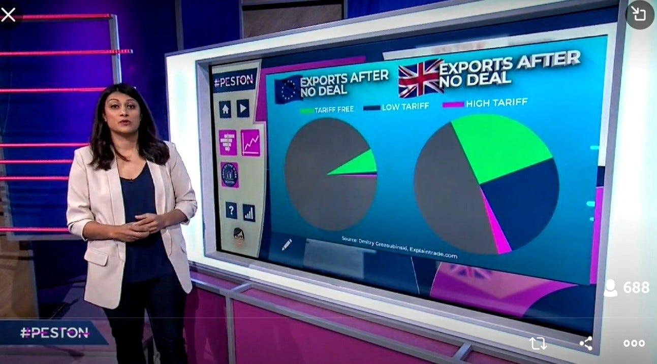
Let the slides breathe. Design them. Make them look attractive and easy to navigate. By all means use pictures. But use original ones, ones that help you make the point you want to make. And if you must include a graph, make it obvious what the graph is telling us and focus on the part that is relevant. If you need a masterclass in how to present graphic information clearly, both visually and verbally, look no further than Anushka Asthana on the current affairs programme Peston every Wednesday night after ITN the 10 o’clock news. Channel your inner her. She makes the complicated comprehensible.
3/ Write your presentation with the audience in mind. You are in the business of writing presentations where your audience needs to take out of the communication what you need them to do. You want them to act. You are, most likely, not presenting to get the practise in. Where are you presenting? Can you even see the audience – it might be a webinar where you cannot see people physically? How long have you got? What time of day is it? What will the audience’s energy level be? Whatever and wherever your audience is, here are some good habits to cultivate.
Never have more than 3 main points for the presentation.
Have an arresting opening and a directional conclusion – people need to know what you want them to do with what you have told them and this needs to be spelt out. They also need to understand the consequences of not taking the action you prescribe.
Focus on how you want to make them feel. Do you want to excite? Or to warn? Or to provoke? Whatever you decide, create your presentation in a way that will deliver the emotions you choose.
Ah. I see we are out of time (which is more than most people do when they present). Which is fine, because we have said all we want to say on the matter. So we will leave you with this little film clip, produced by one of the greatest persuaders of all time: the advertising creative, John Webster. It is a little presentation which makes all these points succinctly in a sixty second film. Just click on the link below the picture and see how even a sock puppet can do this. And if a sock puppet can do it, so can you.


This blog comes from Forthwrite. We’re all about the business of good writing. This is a time when people have never written more – and what we write has never mattered more. Proposals. CVs. Bids. Reports. Documents. And, yes, presentations. The Forthwrite founders have years of experience in advertising, newspapers, magazines and content marketing. If you want to learn to write in a way that will lift your brand, company, resume, destination, bar or blog above the rest, get in touch at forthwrite.co.uk
* Source: KornFerry, Attentiv, The Muse, Cleverism, Microsoft